This post was inspired by a short House&Home article in the Weekend Financial Times (June 2024).
What did we learn from the FT?
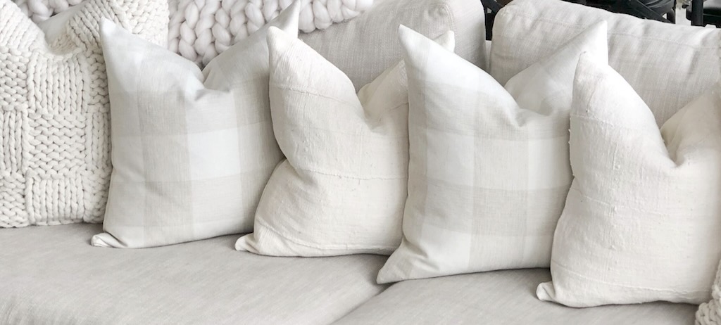
What we didn’t learn was anything everyday and practical. It was all about “design crimes”, cushion couture, and stylistic booby traps.
First, “chopped” cushions is a big NO, so no karate chopping them on the top.
This is interesting since the website Couture Cushion shows on its home page only karate chopped cushions! And they are not the only high-end cushion store that chops its cushions. However, the no-no to chopping is confirmed by other interior designers.
Second, avoid putting square cushions at an angle like diamonds.
Many interior designers confirmed the ‘absolute disaster’ of square cushions being aligned as diamonds.
Third, don’t line them up on top of a sofa back.
Piping, if used, should be slender, optimal 4 mm diameter, and not be showy.
Another “designer” also stressed the point that piping should be discrete and not showy. And it looks as if the 4 mm piping recommendation dates back to 18th century how-to guidelines.
No “bunny ears”, corners should be simply the meeting of two arcs.
Others have added a ‘dreaded’ to the “bunny ears” faux pas.
Zips are not good, because cushions are often left with the zip uppermost and this is not elegant. Unfortunately this means stitching, and that means unpicking them before cleaning. And hoovering cushions is considered bad because it destroys the filling.
Frankly, I think zips are OK, because I don’t have servants ready to unpick and restitch at my beck-and-call.
Never foam. Goose or duck filling is good, and to demonstrate that it not got a pneumatic-like foam filling, cushion must be left a little ‘slouchy’.
Always leave enough space for people to conformably sit down. Ideally on a sofa it should be one rectangle (70cm by 30cm), and a square (60cm by 60cm) either side. Fabrics should be mixed, to avoid the impression of a “dentists waiting room”.
The 60×60 and 70×30 was mentioned several times, and looks to the recognised standard for couture cushions.
Cushions can carry messages, etc., so long as they have a personal connection to the owner. But no flags or fluffy cushion textiles.
Christian Lacroix stamps his name in bold all over some cushions. Someone should tell him it is just not done!
Cushions should be “fluffed out” by lightly pressing their sides, and not shaking them from the top corners.
It’s a big NO to cushions in a modernist interior.
Think Le Corbusier and cushions, it’s a true no-no.
Any more design crimes?
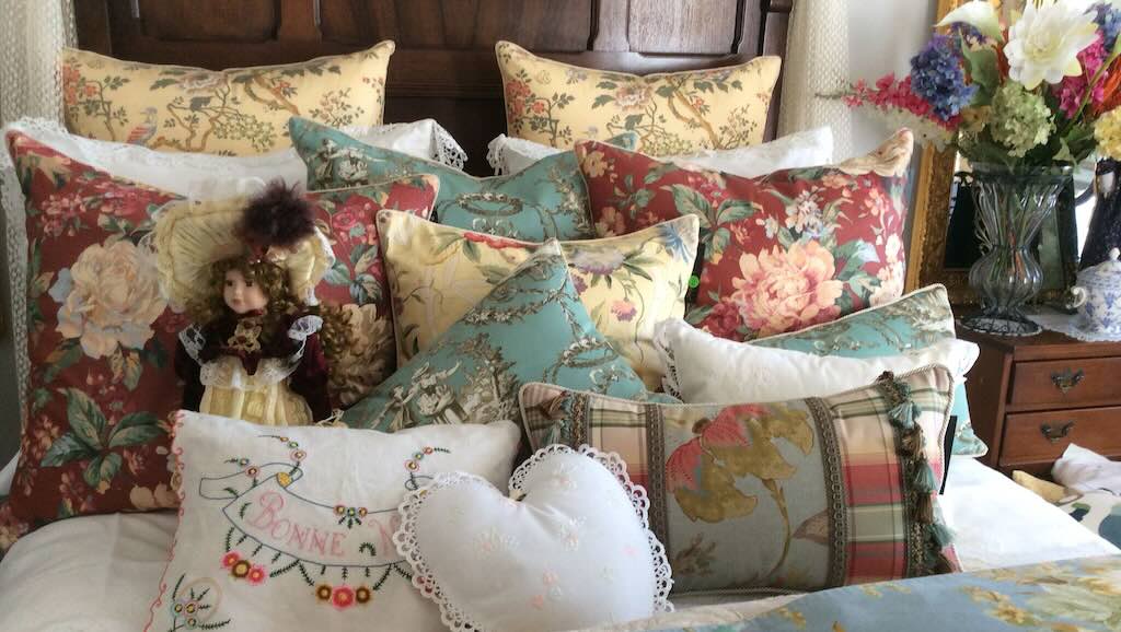
There were some serious complaints about the “fashion” to have lots of cushions on a bed. Many suggestions focused on a simple bolster and good plain white linen sheets.
I know it’s a “first-world” problems, but in some places it’s a problem to know where to put the bed cover, the throw, and all the cushions when you actually want to sleep.
There was an occasional negative vibe about vertical blinds, and the mention that with those type of blinds you could give up trying to create a designer interior.
One question often asked is should the insert be bigger that the cushion cover. It would appear that it should be about 3 cm bigger (one to two sizes up). Decorative cushions (just for show) can be a bit plumper. Over plump cushions are not comfortable. Delicates pattern covers can be damaged if the cushion is over plump.
Standard covers, typically constructed from sturdy, easy-to-clean fabrics, provide a layer of essential protection for furniture. But they can be boring, and actually stop a room looking comfortable and welcoming.
Ornamental covers, frequently showcasing elaborate designs and crafted from high-end materials, inject a sense of artistry.
Outdoor covers are fashioned with a resistance to weather conditions, while throw pillow and chair cushion covers provide an economical and speedy way to inject new life into a room’s decor.
And the last word goes to hostiledesign.org who make a sheet of Design Crime stickers that you can peel-off and stick on the offending object. You then take a photo and send it in. Your fiends might not appreciate it, but can try to leave a sticker in your local restaurant, museum, or (possibly) on a family faux pas.
And suggestions...
The idea for a few, highly decorative, cushions, was often stressed.
One suggestion was to wait until you find the one perfect cushion that you must have, then build around that, not matching, but mixing. And a plain colour cushion can add balance when the mix looks a bit too much. Here the argument was also for cushions of various sizes. Above all don’t match the colour of cushions to the colour of the sofa, contrast in colour and textures is good.
Following fads is bad.
A nice one was to “ignore less is more”, and just avoid “over complicated”. If you start with what you “need”, then add what you “want” that should be enough. But don’t skimp on what you want. Then just keep it all clean and tidy. “Dirty and a Mess” sounds like the ultimate design crime.
Anything else?
Simply put, yes!
Cushions can be prescription items, for example, being used with wheelchairs. There are at least three key criteria to consider. The most important for anyone who is sitting still for any length of time, is to look after the user’s “tissue integrity” (this is more about the cushion cover that its filling). The next is positioning, and to what extent do the materials in the cushion assist in maintaining a healthy posture. The third is functionality, and how well does the cushion enable the user to carry out as normal a daily life as possible.
Admittedly this is more about those who need a cushion and not about cushion couture. But it does also highlight issues of cushion weight, is it to sit on or to support the back, is it easy to clean, does the label indicate its fire proof, how often and for how long will the cushion be used in an average day, …
My cushion choices
Our cushions choices were more about buying what we liked when we saw them, and not about deciding in advance what we wanted and then hunting for perfection.
Are you cushion challenged?
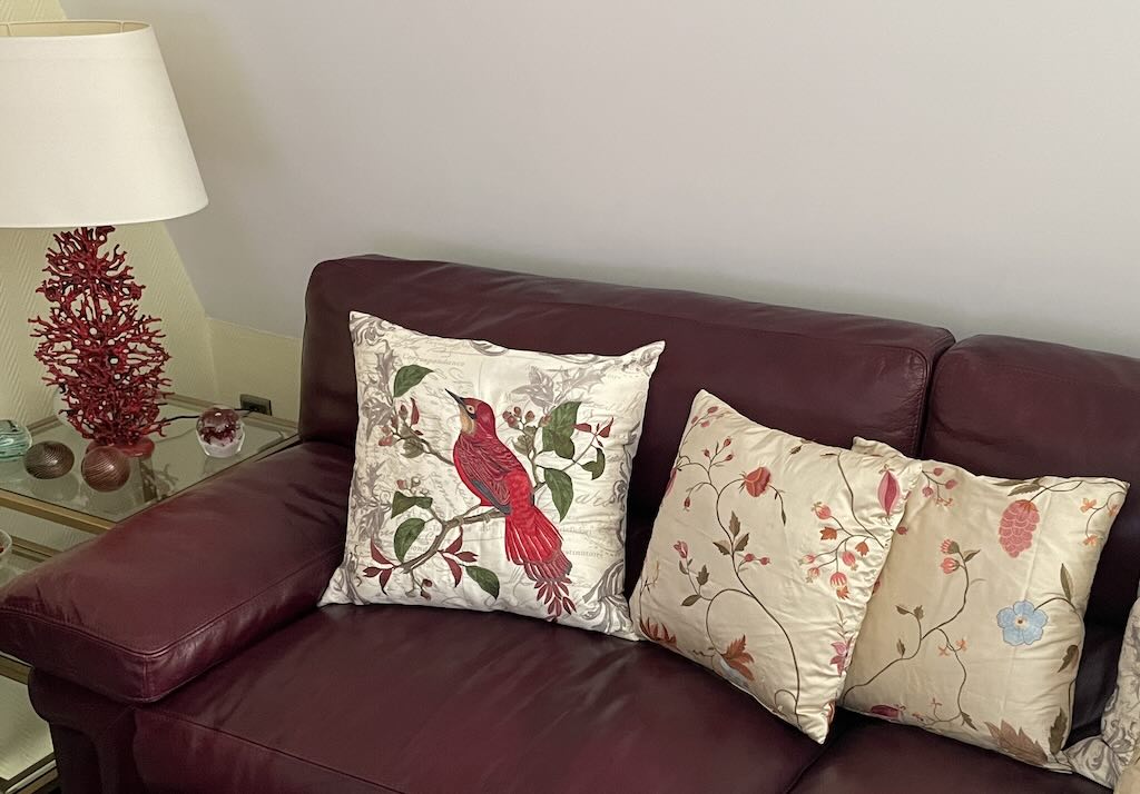
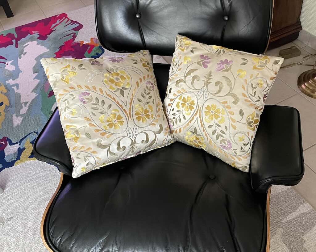
Below we have a few good examples, and a few bad examples. Up to you to decide…which is which.
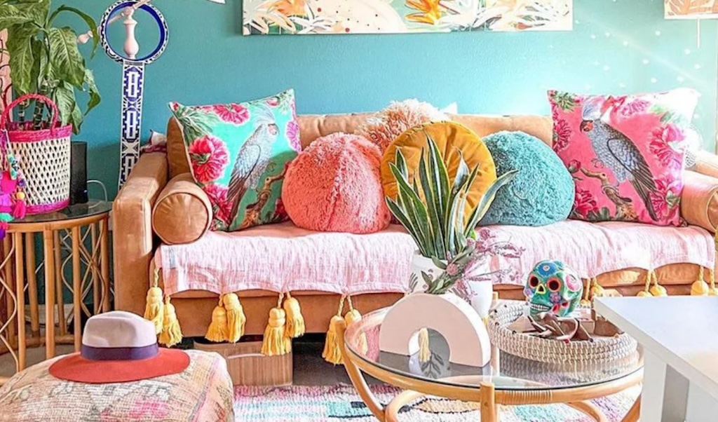
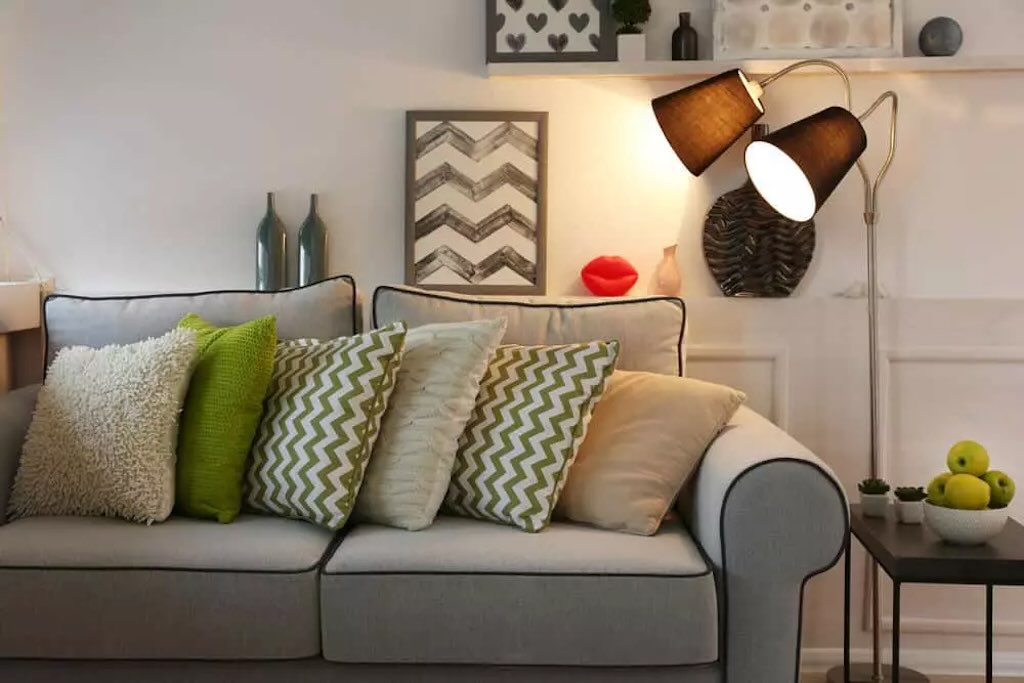
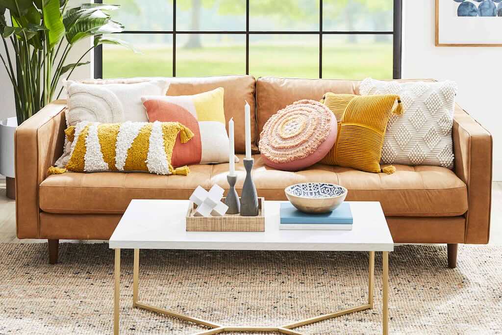
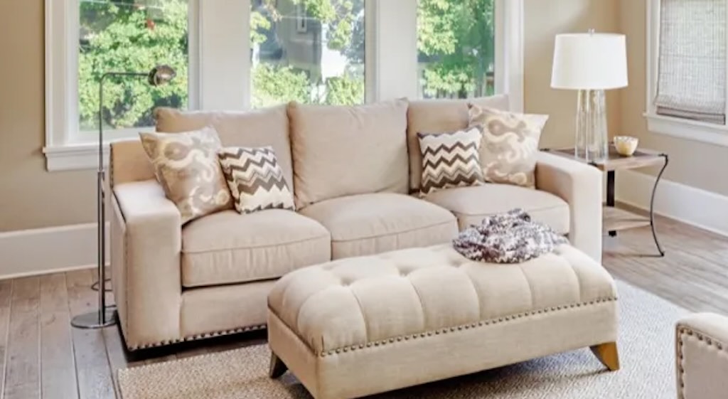
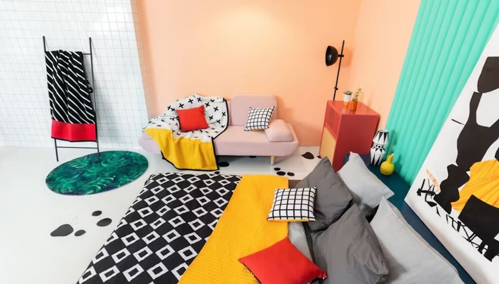
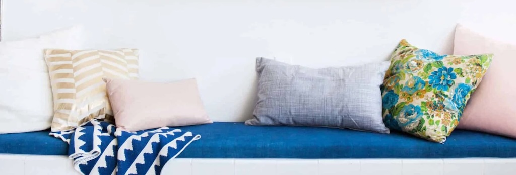
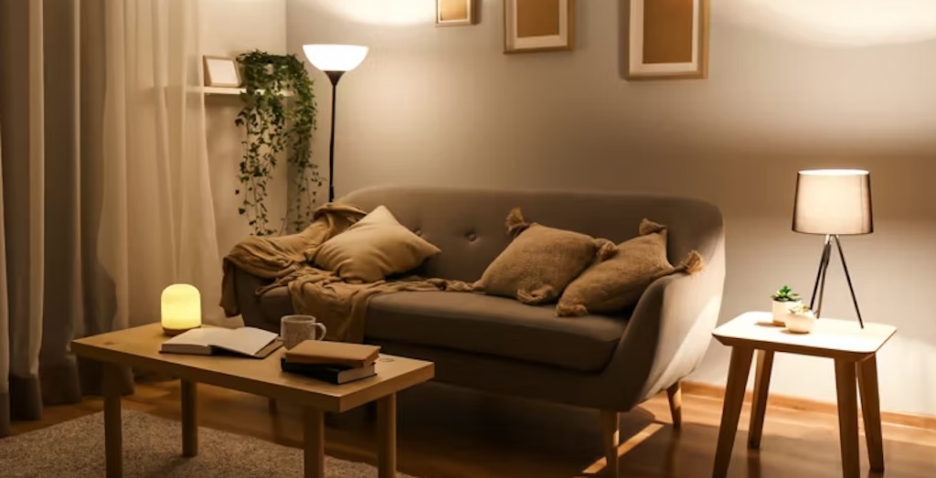
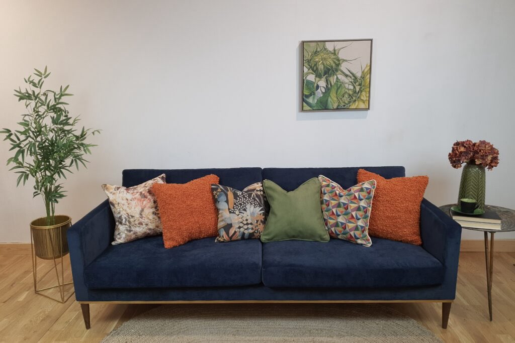

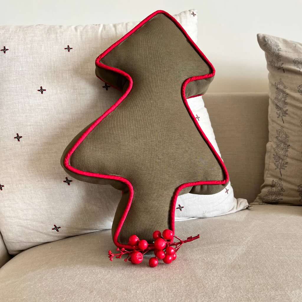
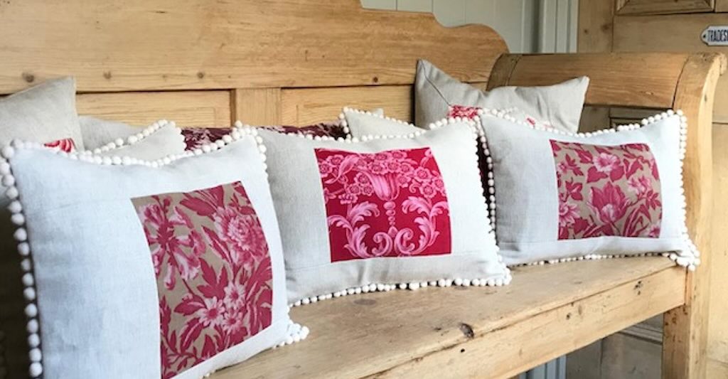
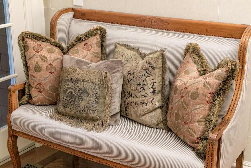
My answers (not THE answers), are that they are all either ‘too much’ or ‘boring’. And I wouldn’t want to live in any of those places.

