
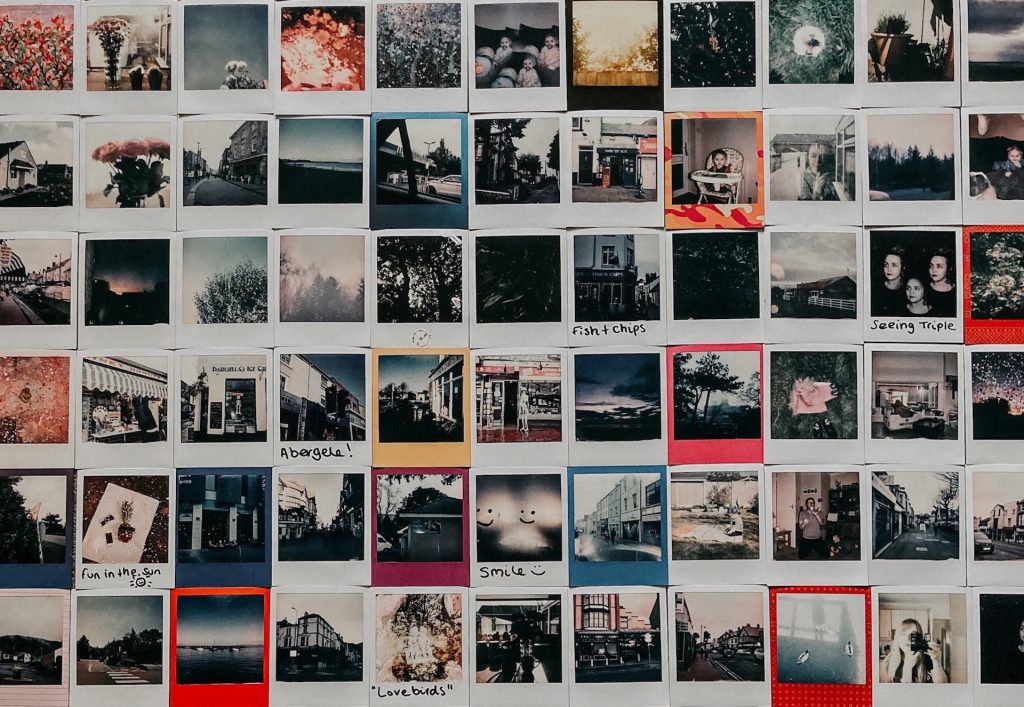
In the past I’ve published some webpages on our travels, and recently I was surprised to find that people were interested in airport lounges, and flying in the A380 and A320. There was also some interest in my pages on Siena, Rioja Wine, and Phuket.
Google is all about search intent, or the primary reason why someone is googling a certain keyword or phrase. If I want well targeted organic search traffic, then search intent should be my number one priority.
Googling my own target keywords and looking at the top-ranked pages is an education in itself. What do they look like? How are they structured? What subtopics do they cover? Doing this I can also start to learn how I should write my blog posts.
So reviewing five “best of” travel blogs seems to be a good place to start.
With these reviews I am only trying to learn what to do, and not do, when starting my own blog.
The below reviews were made in April 2023, and some of the blogs might have changed since then.
The first travel blog I checked out was DAN Flying SOLO.
I liked the homepage layout, and particularly the above-the-fold format. It did a good job in inviting me to scroll down though eight key topics, and ending with a chunky footer.
There was a nice introductory text that told me who Dan was and what his site was about (i.e. trips, places, people who inspire, and adventure).
Scrolling down the homepage revealed eight nicely presented topics, including his latest travel blogs, a seasonal planning topic, a country focus, and a spotlight on sustainability, etc.
The eight topics were presented with two alternating formats. One included a header and a double column format, blue on a white background. The other consisted of white on a dark blue background. I liked the way each topic occupied the full screen, and I also liked the way the blue background blended with the colour of the menu bar.
The logo was cool, and the menu bar was perfect in presenting a few key options. I liked the ‘+’ telling me there were pull-down menus for Destinations and Ideas. And the extensive lists told me that the site could be rich and interesting.
I very much liked the colour scheme which appeared to be inspired by sky blues and cloud greys, which is ideal for a travel blog.
Headers, menu items, buttons, etc. were all in bold capitals and looked well thought out. I also liked the way the blog pages were clean and white. The black text had been greyed, and the white tuned down a bit. The contrast was excellent, and an example to follow, but possibly with a more modern, slightly larger font.
The ‘About Dan’ was extensive, and surprisingly interesting.
However, I was not convinced that the thumbnail photos added anything, except a touch of colour. The role of images was slightly ambiguous. Dan is a photographer, and his full-width photos are impressive, but I was a little disappointed with the need to leave space for ads, etc., meaning that other photos were on the small side and didn’t always add much to the text. The smaller photos didn’t draw me in at all. I hated all the ads inserted everywhere in the text. I enjoyed the videos, and wanted more of them.
I was a bit disappointed by the fonts. I would have preferred a larger more modern, more easily readable font. The font looked OK on a monitor, but less impressive on a laptop screen.
On the content, I first clicked through to Vietnam only to find just one post and a lot of white space. There was a left-hand side bar with search and recent articles, and the subscribe footer from the home page. The post was a decent length but only occupied two-thirds of the screen width. The content was decent, but the original post was not dated, however there was a recent update (9 September 2020).
There were 3 comments on the Vietnam blog, one with a question from October 2022, that was not answered. What’s the point of allowing comments, if you don’t read them and answer questions?
Turning to Spain’s 20 posts, there were too many lists, e.g. 17 best…, 14 underrated…, 7 ways…, etc. To me these type of lists always smack of superficial information. But it was nice to see mention of the Murcia region, Cuenca, Valladolid, Gijón, León and Oviedo. I particularly enjoyed the ‘Magnificent Monastrell‘ post, despite the excessive number of ads.
I read the “21 unique places to visit in Spain” and was surprised that it lacked that first-person attention that I found when Dan described his trip through some of the small towns and villages near Rome. On the other hand, I applauded the mention of Logroño, Guadix, Sanlúcar de Guadiana and Cartagena, some Spanish town that rarely appear in travelogs.
A good test is to return to the same site again a few days later, and try to discover more interesting topics. I did, and I could. In fact I throughly enjoyed looking through Tips & Reviews under the Ideas+ menu.
The Planet D is a site built according to the rule book. It has a simple, above-the-fold full-width homepage, and a standard layout. The site looks very functional, and has a clear message.
I liked the sections on blogging, travel jobs, and remote living. The itineraries and the blogging menu showed that there was content worth studying. I also liked the nice big photos that somehow managed to evoke the subject of each post.
I will admit that there are plenty of posts that I would never bother reading, but the important things is that they are there for someone else to read.
I spent some time looking though the content for Spain, a country they have been visiting “almost yearly for the last 5 years” (another way to say twice or three times). And including a € exchange rate of $1.35 tells us much about how frequently the pages are updated (in April 2023 it was $1.09).
The content for Spain had too many lists (e.g. ’25 of …’. etc.), which in my mind always smacks of superficiality. But there were 13 pages of search results for the term ‘Spain’, and I liked the layout for headings, text, etc., set against a lot of white. I also thought the ‘Table of Contents’ with a menu button was really cool. However, the content itself was quite superficial, but it might be useful for a first-time visitor to a city.
About two weeks later I returned to the site to look at the Switzerland Road Trip Itinerary. Scrolling down there was a section ‘My Latest Videos’ which was headed by an ad for Dulcolaxo. The video itself was about Christmas in New York. This insertion, totally out of context, didn’t do any favours for Switzerland, my choice would be Christmas in the Big Apple.
But at the same time I discovered a really interesting posting on luxury hotels in Milan, a city we wanted to visit again. Shame there was no mention of practicalities such as parking, etc. This highlighted how some travel blogs focus more on photo opportunities, etc. and less on providing practical information.
The Blonde Abroad

I didn’t want to, or expect to, like The Blond Abroad. But it had a number of interesting features, despite it being inundated with photos of the blonde, presumably abroad.
It appeared to have a lot of content, and from what I saw I would be prepared to spend time hunting though the pages to find what I wanted.
I’m certain that for the single woman traveller this site and blog would be very useful.
The colour scheme was very laid-back, slightly faded, which accentuated the colours of the photos. But I’m not sure if the fonts and font colours were perfect in terms of readability and accessibility.
I decided to check out Spain and the city of Málaga. Instead of finding some ideas for a visit (I know Málaga quite well), it was in fact condemned to a few lines in a list of Spain’s lesser-known destinations. What a disappointment. And to heap insult on injury, she classed Segovia, Salamanca, Córdoba, and even Granada as other lesser-known destinations.
About two weeks later I returned to the site to look at her Blogging Resources, and in particular the “20 Things I Wish I Knew Before I Started a Blog”. Whilst I’m not a fan of the look and feel of her website, she certainly knew about the day-to-day operation of her own blog.
I read through her post and found a number of interesting comments worth following up, in particular on SEO keywords, etc. I liked her example of changing a title from “My Experience in Prague” to “How to Spend 48 Hours in Prague”, and with a bit of re-editing, it’s possible to “re-energise” a posting, and its ranking on search engines. She mentioned also the interest to insert forward links into older posts, at the same time as refreshing out-of-date information.
Never Ending Footsteps

Never Ending Footsteps didn’t immediately capture my attention (or my imagination). But I noticed “How to Start a Travel Blog” in the menu, and so I decided to delve deeper and check out some content. I found 14 posts on Spain, all nicely titled with decent, informative images, and behold, a post on Exploring Ronda (a place I know reasonably well).
The website looks to have been built according to the rules. In fact it looked and felt like a good standard template, no visible frills, no pop-up’s. So what made it one of my “five best”? Well, exactly for the reason that it was a good use of a standard template. It has two menu bars, on top the usual Home, About and Contact, but with a few innovations. Below the page-wide site logo, there was a menu bar with the world divided into eight areas, e.g. Africa, Asia, etc.
I thought the Blog and Travel Expense Reports were innovative menu options. The Blog listed every post she had written (great idea), and the Travel Expense Reports looked at the cost of traveling in places such as Egypt, Vietnam, Cook Islands, Bolivia, etc.
The description of Ronda was fine, if very superficial, and limited to describing the photos. Unfortunately many of the photos could have benefited from a full-page presentation, rather than being squashed into a half-page width. But it was nice to see that they managed to get down into the gorge and take a country walk outside Ronda town centre.
I also checked out her posts on Italy, which confirmed my overall impression. In terms of pure travel blog content I would probably scan what she has written, but it would not be the first place I would look when planning a trip.
The real reason why I’ve included this particular travel blog in my “best five” was the way she described setting up and running her own travel blog (and she has a physics degree which is so cool). Her bio was also a welcome addition to understanding how she made travel blogging a way of life.
Pierre Blake

Now for PierreBlake, a travel blog that focusses on hotel and restaurant reviews.
In many ways it’s a simple, clean blog with just two themes, and it presented both in a very simple way. Use the search function or just pick from a long page of images and headers, again very simple.
Let’s take a look at the Gran Meliá in Rome. Text (42 lines) intersperses between 22 photos, and a scorecard at the end (he gave it a “good, but could do better” 7.9/10). He did not explain why he picked a Spanish hotel chain in Italy!
Turning to the review of the Dopolavoro restaurant, this time 12 photos intersperses between a 58 line text (he scored it a credible 8.2/10). In each case the review had a few extra photos tagged on to the end (5 and 12 respectively).
The more intriguing part was Lifestyle, where our Pierre Blake blogs on living frugally, being eco-friendly, and living out of a carry-on. So a kind of luxury backpacker.
The Points Guy

Yes, a sixth review, consider it a “get one free”, because this is a blog I actually visit quite frequently (but I’m not a subscriber).
The Points Guy is a US site that looks at ways to accumulate and use airline points and miles. It also analyses airline and hotel reward programs, and provides credit card reviews. And on the side it includes reviews of airlines, hotels, airport lounges, etc.
It’s a messy looking site, but more importantly it has a lot of content, a lot of subscribers, and a lot of advice on a precise set of topics. It’s a great example of being well respected, despite its look and feel, not because of it.
The key is that the information exists, and I know I will find what I need on this site.
A great example is the review of Hilton in Universal City in Los Angeles. It’s a good review, but more importantly it highlights the hotels most important feature, it overlooks Universal City. It’s also one of the hotels we used in 2012 when visiting Los Angeles. The review chimes with my opinion of the hotel, suggesting that other reviews might prove just as informative in the future.


The website looks to have been built according to the rules. In fact it looked and felt like a good standard template, no visible frills, no pop-up’s. So what made it one of my “five best”? Well, exactly for the reason that it was a good use of a standard template. It has two menu bars, on top the usual Home, About and Contact, but with a few innovations. Below the page-wide site logo, there was a menu bar with the world divided into eight areas
Departement of Philosophy
Departamento de Filosofía
https://www.univ-msila.dz/site/shs-ar/
https://www.univ-msila.dz/site/shs/