The above image is not a closeup of my aging skin, but simply some nice crusty pastry, and a metaphor for my increasing annoyance with everything that is fake, i.e. fake elegances, fake ergonomics, fake aesthetics, fake medicine, fake politicians, fake opinions (both positive and negative), fake education, fake culture, …, need I go on?
It was on Sunday 11 August 2024 that I received an email which included a couple of home design photos. Nothing special. I usually just “ignore&delete”. But this time my crusty edge showed up, and I actually took a look at these two photos. What shocked me was their relative banality and the absurd headers attached.
So I decided to create this post to collect what I see as either fantastic or absurd modern-day design memes (mostly absurd).
What is good design?
Someone quite rightly wrote that it’s rare that there is a black-white definition of ‘good’ or ‘bad’ design. It’s more about a spectrum of possible outcomes, each valid depending on the criteria used to evaluate them. But in its simplest form, good design is about delivering on a set of stated goals in the most enjoyable, efficient, and elegant way possible. Bad design is trying to do the same thing, and failing, miserably.
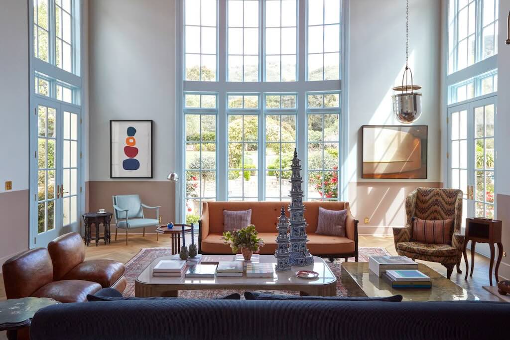
You see the above photo, why do you think someone has designed that space? It certainly impresses, but if the space was empty, it would still impress. So the content is in some ways useless, it adds nothing, which is probable the best it could achieve given the circumstances. But I would just note that despite the views out to the gardens, most of seating points to two (not one, but two) “coffee tables”, with the usual stack of out-of-date magazines placed there to impress the visitor. I would also point out that the evening-nighttime lighting on offer is a disaster.
However, my view of good design in terms of decor is firstly, practicality, and secondly, comfort. Have a look at the below photo of another imperfect living space, and decide which would you rather live in?
Design Trends 2025
I won’t give a reference, but one ‘prestigious’ art magazine listed some top trends for 2025, namely:-
Which decade’s style will make a comeback in 2025?
1920s-1930s – Art Deco, Bauhaus
And what won’t? 2000s – white everywhere
What will be the hottest colour in 2025?
Dark brown/Chocolate
And what won’t? Neon yellow/Hot pink
Which materials and finishes will be popular in 2025?
Brass/Bronze
And what won’t? Acrylic
My opinion – Think outside the box with the 1960s, terracotta red, and walnut.
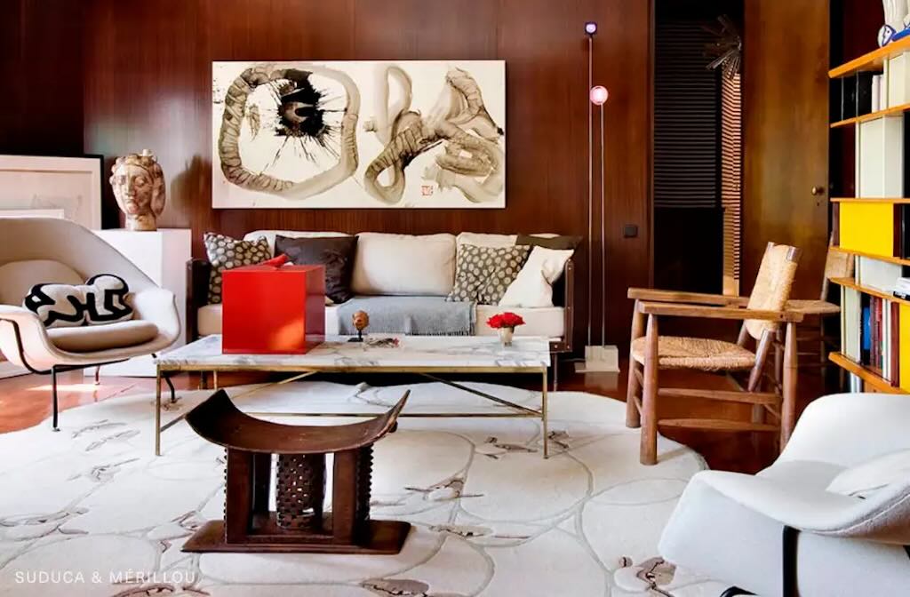
Parisian Pied-à-Terre
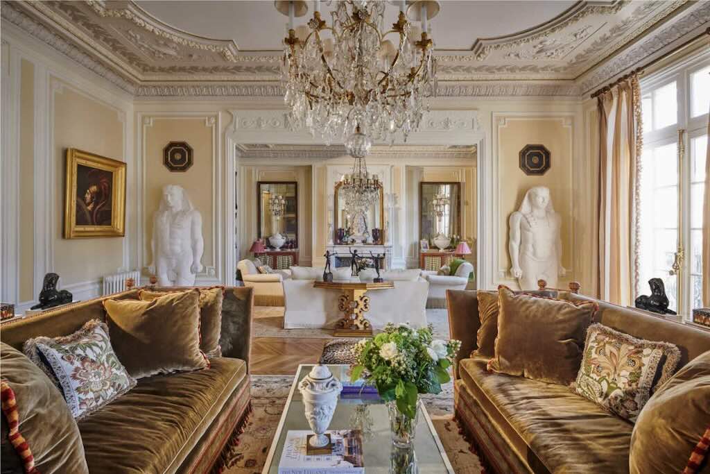
The first thing to note is that a pied-à-terre is usually a small apartment, often located in, or near, the centre of a large city and not used as a primary residence. So a kind of temporary second residence, but not a vacation home (and not a real résidence secondaire). Larousse tells us it’s a “logement où on ne réside que pour de courts séjours”. Does the above photo look like a pied-à-terre?
My real problem is with the two identical Egyptian-style statues. Firstly, they are out of context in the room, but my problem goes deeper. If they were authentic (and probably stolen), they should be in a museum, or at least given pride of place (any self-respecting art thief would know that).
But they are (I guess) certainly fakes. Alright, reproductions, since they clearly are not trying to fake the real thing. So what does this tell us about the owner? Are these statues a way to display the owners wealth (the room oozes money), is the owner seeking validation of their achievements and possessions. The key question is, do the statues glorify the owners lifestyle? Owning some reproductions, nicely “hidden” and to be “discovered” by the observant visitor, can subtlety underline the owners culture and wealth, but this is not the case with two life-size Egyptian-style copies.
Looking around the room we are clearly not looking at someone passionate about archaeology or egyptology, so the statues are just decoration, designed as attention seekers, the owner is “showing off”. The worst thing is that such an ostentatious statement with fakes, reflects badly on the owner, defining them as also being inauthentic or “fake”.
I know I shouldn’t judge someone by their outward appearance and by what they own, but the reality is that we often judge the content by the packaging. And here we have someone shouting “judge me”. So be it.
Aspen Mountaintop
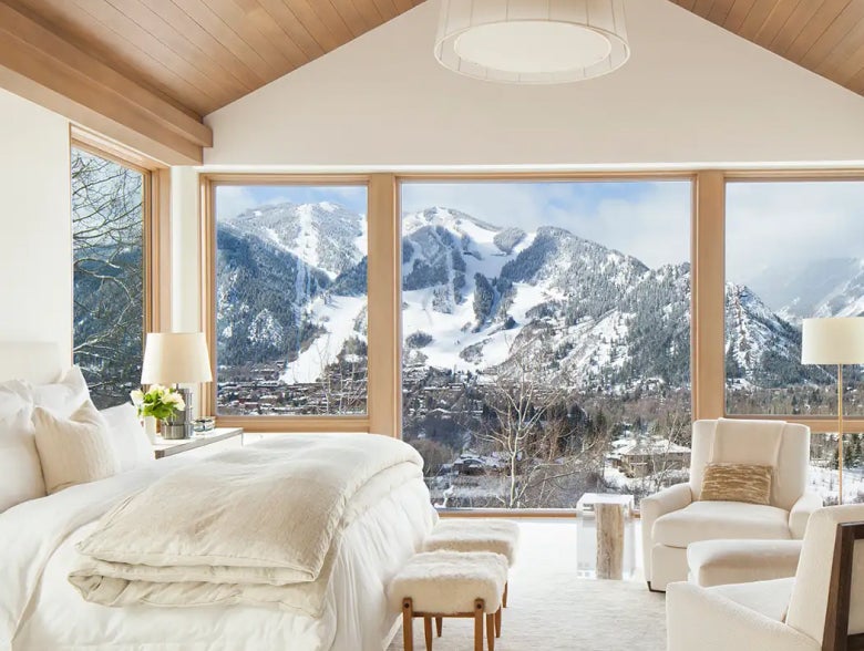
This is just to prove that I’m not always “crusty”, here we have a really beautifully designed mountain retreat. With the magnificent view, all the designer needed to do was not compete. And he did just that, and with great skill.
Although “karate chopping” the cushion is very “not in”.
Dutch museum finds beer can artwork in bin

It was reported that a lift technician saw two old empty tins of beer, and threw them in the bin, not realising that they were “art”. I personally think he did the right thing!
A Reimagined Townhouse
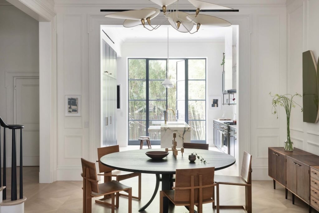
What can we say about this boring and very cold looking space, consisting mostly of 100’s of litres of white paint?
My main question, does this look like a welcoming, comfortable social space? Perhaps some light Schoenberg in the background might soften things up a bit.
Firstly the Maide chairs look decidedly uninviting and uncomfortable. No arm rests, what next? Can you imaging having dinner there and not asking for a cushion? And what’s with only five seats? The Marlieke van Rossum table has some nice curved legs, but let’s face it, it’s just a black round table. This is not “timeless” design, it’s just boring design.
That central lighting (sorry chandelier) by Diego Mardegan looks impressive, but I suspect it creates an unforgiving pure white light, and no atmosphere. And you don’t have any choice, because there are no wall lights, and no wall sockets.
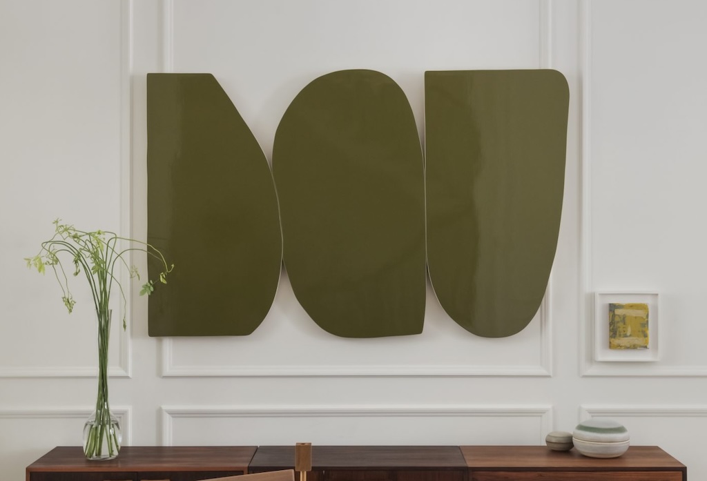
We are also told that the artwork on the wall is by Andrew Zimmerman. Personally I would not be willing to put my name on such an object, but, depending upon the price paid for it, I might be willing after all. Even the poor old flowers have lost the will to live.
Once a “large artwork” is hung on the wall, it’s too difficult to remove and take to the recycle centre, so you keep it and vainly hope it becomes a “conversation piece”. People are bound to ask “what is it?” and “what does it mean?”, so you had better be ready with a cheeky answer such as “I found it in a skip at the back of Harrods”. They will also ask about the artist and the gallery that sold it, so they know who to avoid, and where not to go.
And finally who hangs small framed “masterpieces” at stomach height?
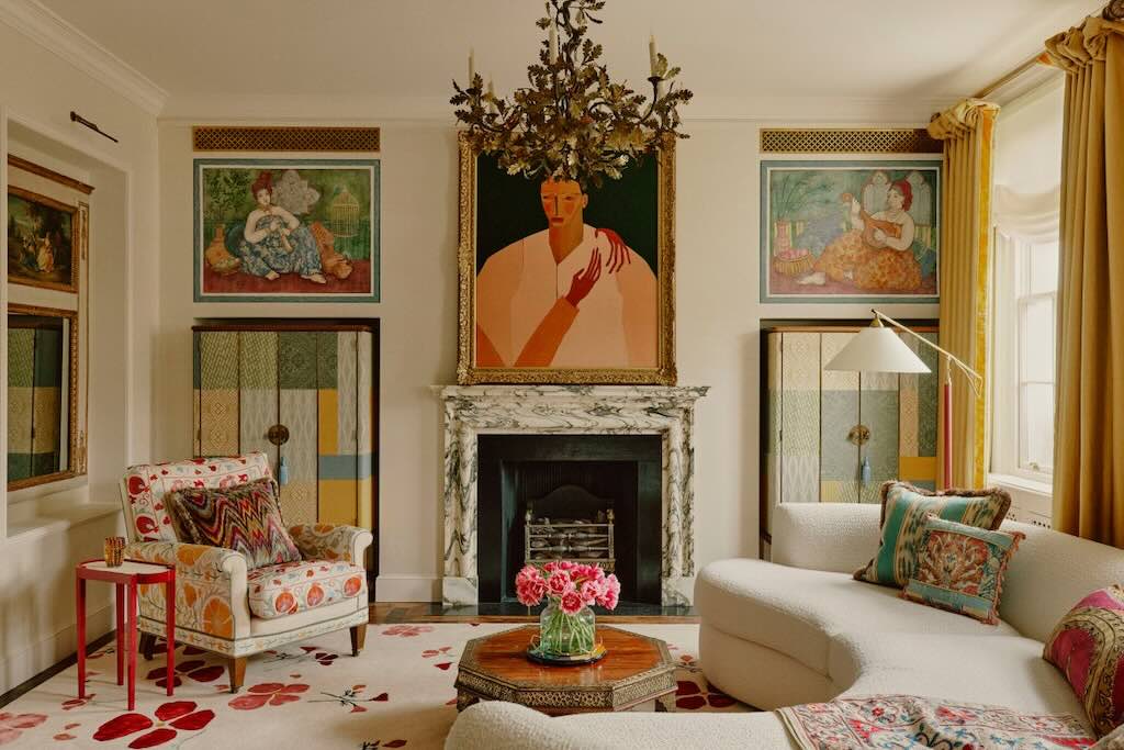
Intriguing interior
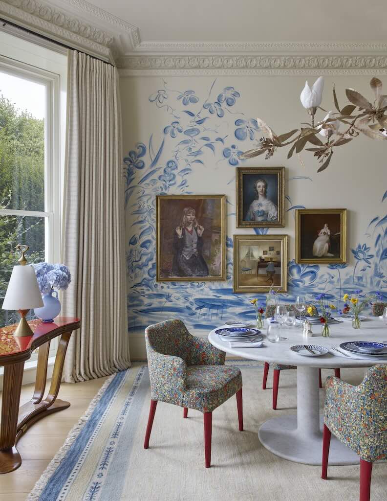
When I saw this interior I was a little bit shocked by the paintings. I’m certainly no design expert, but I felt that the entire interior was very pleasant and at the same time both coherent and interesting. As the description pointed out there was a nice mix of the custom mural with the contemporary dining table, the carpet, the botanical chandelier, and I loved the fabric on the armchairs.
The description described the four portraits of women. Clockwise from left we have Portrait of Blonde Girl, 1950, by John Miles Bourne Benson, then Anne Burges, 1751, by Francis Cotes, then A Portrait of Marianne Langham, ca. 1808, by Jacques-Laurent Agasse, and finally a sunlit interior, date unknown, by Peter Vilhelm Ilsted.
The description then went on “The paintings not only complement the room but they also stand out on the mural, as they are in bold, ornate gold frames”. So the decision was explicit, and it clearly worked. I learned a good lesson, a statement is a statement, and does not have to always “fit-in”.
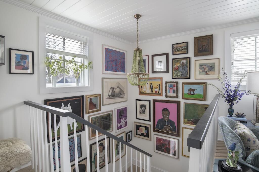
The above collection is clearly also a statement, it says I know what I like and I enjoy seeing them all side-by-side. And maybe, a little “and I don’t care what you think”. I’m sure I would not have been able to put all these together in such a pleasing and intriguing way. I wonder if these walls were “curated”, or did they just emerge organically over time. In any case I would love to learn how the owner manage to get it right.
Zebra cushions
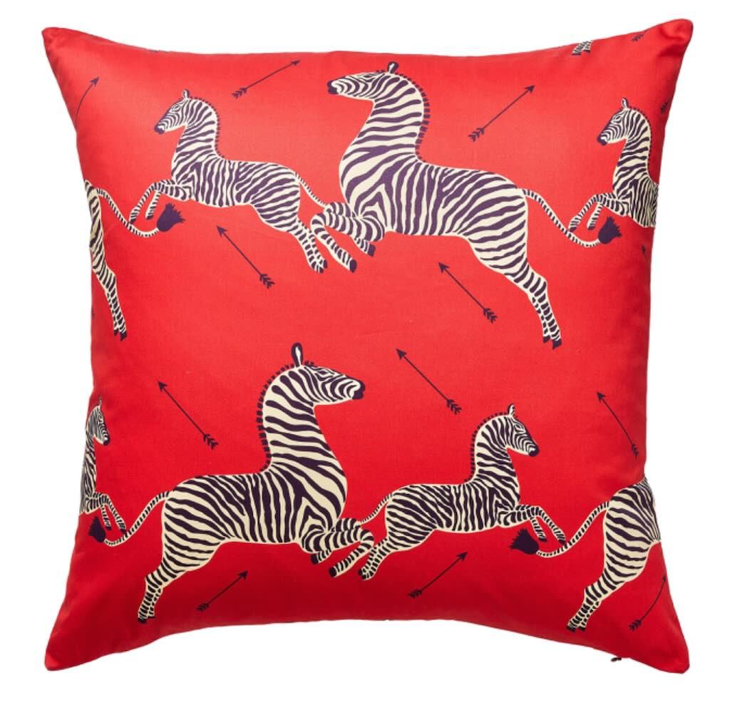
Here we have a nice colourful 60 cm by 60 cm cushion, although the seller calls them “Zebras Petite Pillows”. Are these designed for sleeping zebras?
For me the difference between pillow and cushion boils down to understanding their primary functions. While both offer comfort, their usage and design cater to different needs. Pillows are primarily for rest and sleep, while cushions blend comfort, support, and decorative elements.
Zebras are the right plural form for more than one zebra, but zebra can also be used as the plural, and “Zebra Cushions” just sounds better.
And putting zebras along with arrows might on the one hand irritate those who defend animal rights, and on the other hand might also irritate any anti-colonialists in the room. And is that colour “blood red”?
Still, what do you think is the price for one of these polyester “pillows”? Yes, €300.90 each (shipping extra). I love the €0.90, maybe that was the price to make the cushion in a “competitively priced” offshore manufacturing sweatshop.
The promotor quite rightly noted that it was priced above the “recommended price”, of …. €291.00.
One element that I found odd, was the thickness of only 1 inch (2.54cm). So does that mean that after coughing-out €300.90 for a “pillow” you still had to buy goose down for it, and get your maid to stuff it?
The “New Romantic” Aesthetic
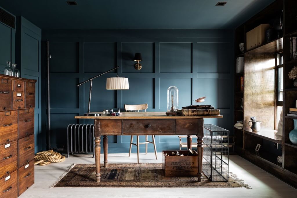
The header for this photo was “The “New Romantic” Aesthetic of …. Puts Emotion at the Heart of Her Designs”. I don’t include her name because I’ve no proof that she actually knew about or agreed to this title.
It’s a “new” romantic aesthetic, but we can at least start with what was the “old” romantic aesthetic. So first-things-first, I don’t see any neutral tones, collection of old books with gold edgings, curios collected in travels, family photos, etc. Nor do I see any velvets, deep reds, emerald greens, paintings, candles, gardens views, etc. Do I see anything that suggests love, passion, an intimate relationship, or even an emotional connection with someone or something?
So it looks like we need to try to unpick this different “new” romantic aesthetic.
What we have is a kind of darkish gunmetal blue, which I personally have always associated with a sense of rational professionalism and even emotionlessness. I agree the presence of the old furniture and carpet helps soften the overall impression, but only so far.
The filing cabinets and carton boxes perfectly aligned above the window, suggest a focus on regularity, organisation and attention to detail. We are in the presence of someone who still writes with ink, has kept the old table he no doubt inherited, and sits on a very uncomfortable high stool. For some reason, judging by the presence of the draw, he sits on the far site of the table, and anyone entering the room is obviously expected to stand (hat in hand perhaps).
Lighting looks to be very poor, and the owner has decided not to plug in the table lamp, which in style looks a bit out of place. Or it might be that someone has forgotten to put some electricity sockets in the room. The badly situated cast-iron radiator suggests poor heating, so the owner likes to keep our “new romantic” environment cold and dark.
How are we to associate a romantic aesthetic with the box from Hercules Powder, a maker of chemicals and munitions, and why is there a coiled rope thrown onto the floor in the corner? Does this symbol suggest that the owner has no permanent relationships, no “anchor in life”? Or does it just symbolise the extension cable the owner will need to connect his desk lamp?
What can we conclude from the uncomfortably low bench placed in one corner, or the empty metal cage-like framework precisely aligned with the edge of the desk? What use do they have, or are they just decorative? And does not an empty cage symbolise confinement or oppression.
And of course on the desk there is something that looks like a handbell under a glass dome. Perhaps it is used to “ring in” the next visitor? It’s clearly placed there to impress whoever is standing there, but does it ring “new romanticism”?
This room is beginning to look like the office of a modern-day Ebenezer Scrooge.
Subtly Whispers Summer
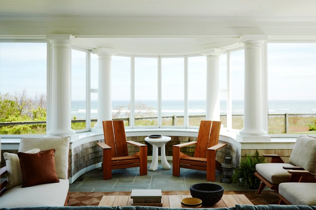
The header for this photo was “A Cape Cod Home from … Subtly Whispers Summer”. I must admit on a first glance this is a pleasant photo.
Cap Cod has a historic, maritime character with ample beaches that attract tourist during the summer months, and at the same time is a popular retirement area.
Somebody has gone to great lengths to create a wonderful view out to sea. The elegant flooring looks to be of grey slate, but I’m not a fan of the shingles on the low interior walls.
My real difficulty starts with the two very uncomfortable looking wooden chairs. They might be a famous design, or they could be from Amazon, in any case they are garden furniture and out of place. With that view outside, would you decide to sit in those hard wooden seats staring at an interior wall?
I surprised myself in finding the small white John Dickinson “African” side table quite at home. But the rest of the seating also looks ordinary, unused, and unloved.
More generally the architect has created a unique environment to enjoy the view, yet the owner has place the seating around a banal looking coffee table (another Amazon find?). They couldn’t even come up with some attractive looking coffee-table books. The old storm lamp on the floor next to a bored looking plant, don’t “subtly whisper summer”.
My impression, judging from the sky and sea outside, winter is on its way, and the owners servants have simply brought in the terrace furniture and arranged things as best they could.
With that view out to sea I personally would want the furnishings to shout “look outside”, all year round.
The French Way
The “French Way” text told us that we were looking at a “curated collection” of French antique and vintage pieces, and mentioned Guillerme et Chambron furniture, René Lalique decor, Charlotte Perriand lighting, and “so much more”. Love the “et”, very French.
The retro-style wood veneer wall panelling (50s to 70s) certainly adds warmth to the room. I’m not sure what a René Lalique decor should look like but here I can’t see any echos from the René Lalique room in Calouste Gulbenkian’s residence in Paris, or the white walls of Villa Lalique. And more generally the room does not ooze an Art Deco appeal.
I guess the reference to (Robert) Guillerme et (Jacques) Chambron points to the furniture makers Votre Maison born in 1949. Given that they focussed on inexpensive, sturdy, and authentic furniture with waxed wood and thick cushions, I guess that the sofa at the back might be an example of their work.
I am at a loss to identify Charlotte Perriand with lighting given that the wooden structured seat on the right is her Mulched chair No.21. And the bookcase on the far right looks to be very much like the one she designed for the Maison du Mexique student’s room in 1952.
The most obvious piece of furniture in the front is not French, but could be a tribal Ashanti stool from Ghana.
Also on the wall is something that does not look particularly French, and might even be a Sōfū Teshigahara (or inspired by his floral art).
The white chair on the left looks to be an example of The Womb Chair by the Finnish-American Eero Saarinen, and the white chair front right could make that a pair.
The stone head certainly looks like (or is inspired by) a 2nd Century AD Roman head of (for arguments sake) Venus.
I’m disappointed because I can’t identify the coffee table, even when the legs have a very unusual and unique design.
Can’t say much about the boring floor light, or the big red box on the coffee table, but for me the carpet makes this room (without it the room would be totally “dead”).
Whilst some of the pieces on show are by French designers, the room does not oozes a French way of life.
But what is the French way? My wife was French and for me the French way is not about France, but about comfort and the little things scattered around a room, e.g. a family photo, colourful cushions, cut flowers, a painting inherited, and something small bought recently in the local flea market and given pride of place (temporarily). And not forgetting a Hermes handbag, mobile phone and Citroën 2CV car keys, sitting next to her favourite eau de toilette.
The French way is all about French women, and this room is not feminine. It looks comfortable enough in a masculine kind of way. but I’m missing “the love”.
Vintage Modern Fantasies
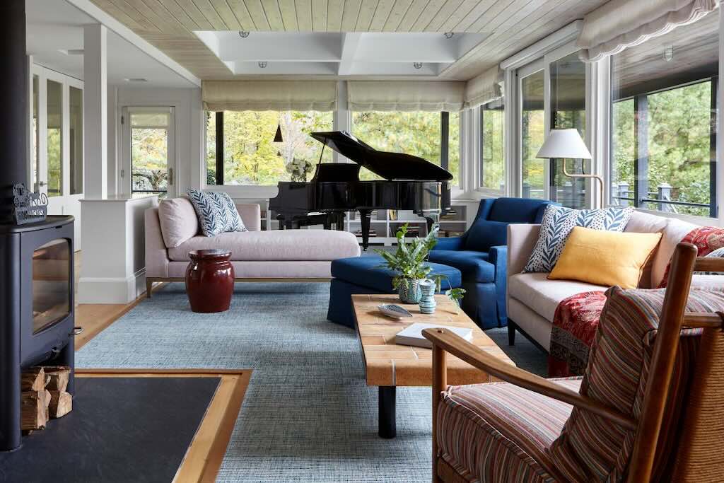
Here the designer is working with a living and dining areas and a sun room, and has adopted a mid-century Scandinavian style. I find it a pleasant and comfortable looking space, and I like the way the windows are left uncluttered, and colour comes from the furnishing. I like the choice of a “classical” style wood-burner, and the large slate floor plate. But I’m not sure where the “fantasies” are? If anything, the design choices create a calm, comfortable and predicable living space.
The one question I would have is that a grand piano should be not placed in direct sunlight, or near large windows, and not in a room where the temperature might vary quite a lot. And I suspect that the acoustics in this veranda-style room will be far from perfect.
Art and Craft in Brooklyn
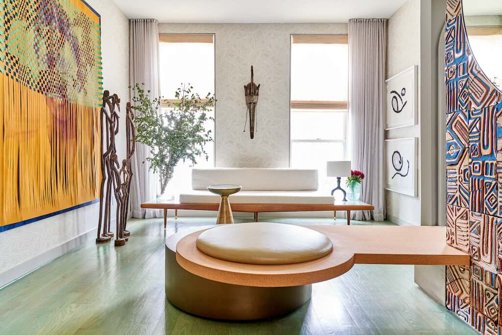
In this Brooklyn living room we are told that the designer has placed a 1960s Adrian Pearsall platform sofa with connected marble end tables, alongside some West African sculptures, and (I quote) the sofa’s “visual weightlessness brings calm and openness to the space”. We are also told that the bench in the foreground is anchored into a “Legacy Wall”, consisting of a “striking fireplace surround” made from “intentionally fragmented terracotta tiles”.
So what we have is quite a colourful space, white walls, high ceiling, good large windows, and a lightish green laminated floor. I guess with the floor the idea is to suggest a nature-inspired space. This choice is of course a matter of taste, but for me it is too close to the colour of flood water. But I’m sure it’s easy to keep clean.
I’m not sure about the long white curtains that appear to be there only for decoration. I appreciate that the white blinds on the windows help keep the space light and calm, but my inquisitive mind asks what are they trying to hide outside?
In the photo the bench takes up quite a lots of space, and, for me, looks quite uncomfortable. It’s not really part of the social space defined by the sofa, so it must be part of the social space around the fireplace with the tiles. The tiles are by Malene Bernett, and are part of her “Legacy Wall” which is well described on her website. They are a vibrant cultural statement and certainly leave the rest of the room “trying to catch up”. Although I did feel that the fireplace itself seen on her website looked a little small and impractical.
The Japanese-inspired abstract art doesn’t stand much of a chance, nor does the drift-wood-style standing Africa sculptures. The Marka tribal mask is nicely placed on the far wall, but they have become something of a tourist piece in recent years. The colourful tapestry by John Paul Morabito should not have to compete with the fireplace tiles, and merits its own space.
What lets this room down are the little “extras”. The Adrian Pearsall platform sofa looks both lost and very uncomfortable, and I can’t see the “connected marble end tables”. The Marlow Mod pedestal table looks equally lost and unpractical, as does the Alexandre Logé lamp, which in any case does not work because it’s not plugged in. I would also have liked to see this space in an evening/night setting with the lighting, or absence thereof.
So what we have is a smallish nondescript room housing the impressive Malene Bernett “Legacy Wall” and the John Paul Morabito tapestry. My suggestion would be to keep one of them (I would keep the tapestry) and start again to make a comfortable social space.