In early 2023 we completely redecorated of our Spanish holiday apartment. This involved removing everything from the walls, filling holes and cracks, etc. and applying two coats of paint.
Then we had to decided how to hang and re-hang our collection of paintings, maps. etc. to make a gallery wall, or even two gallery walls.
In the old days these were often called salon walls, a wall on which a number of pictures of varying mediums and sizes were hung next to each other.
How difficult can hanging paintings be?
In the past we had hung only 5 paintings, and two maps, but over time we had accumulated a few more paintings, etc. that we have never got around to hanging.
So we found ourselves with as many as 15 items to hang, in more or less the same space.
We had two walls:-
- A main wall 350 cm long by 240 cm high, but with a 330 cm long divan that that was 65 cm high (leaving 175 cm for hanging)
- A second wall 220 cm long by 240 cm high.
And our collection included (all in cm):-
- Two large maps – 95 by 90 and 80 by 65
- Three largish paintings – 76 by 59, 80 by 64 and 85 by 64
- Three decent size pieces – 67 by 51, 70 by 52 and 52 by 41
- Seven smaller paintings, prints and maps.
Some rules about hanging paintings
Searching around we came across a lot of advice about how to best to hang art works, and even how to create our gallery wall:-
- Most experts noted that the biggest problem is that people hang their art works too high on the wall.
- They all advised to start with the largest pieces first. One idea was to divide the wall into four equal horizontal bands, and start by situating the paintings, etc. in the third band from the floor. Place the largest piece in the centre or slightly off-centre, then build around it.
- The centre-point of an art piece or grouping should be about eye-level. It’s often mentioned that museums hang at 145 cm above the floor, but opinions varied between 145 cm, through 155 cm, to 165 cm.
- Everyone mentioned to line up similar frames on the centre line, not on the top or bottom of the frames.
- Space between art works should be between 5 cm and 10 cm, and never be more than 15 cm (opinions varied on this one, but some experts suggested googling images of gallery walls).
- If the idea is for a more ‘organic’ layout, the advice was to try to keep the distance between all the frames more or less the same (inconsistent spacing is bad). Specifically it was mentioned that a gap of 5 cm was enough for one piece hanging above another.
- Art hanging over a sofa or a piece of furniture should in principle cover only about 50% to 75% of its length.
- Above furniture or a sofa, leave at least 10 cm to the bottom of the art work. Many experts advised up to 20 cm above furniture and even 30 cm above a sofa, whilst other advised no more than 10 cm above a sofa. Some experts suggested leaving less space for larger art works, and more space for smaller art works. If it’s a collection of art works, it’s best to keep the centre of the group at about eye-level, but above a sofa or furniture the eye-level can be raised to 155 cm to 165 cm. Lots of warnings about not hanging stuff too high above a sofa.
One piece of counter-advice was to ‘break the line’, and don’t hang similar sized paintings in a line. This idea suggests that the collection has been created over many years, and it’s reflected in the wall.
Where to start?
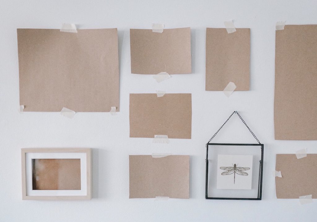
The best way was to start is to lay out the paintings, etc. on a large surface, e.g. on the floor in front of the wall.
Another technique is to cut properly dimensioned paper squares representing the paintings, etc. and start sticking them on the wall.
I also made some simple drawings to understand the proportions and overall dimensions of the walls and hanging options.
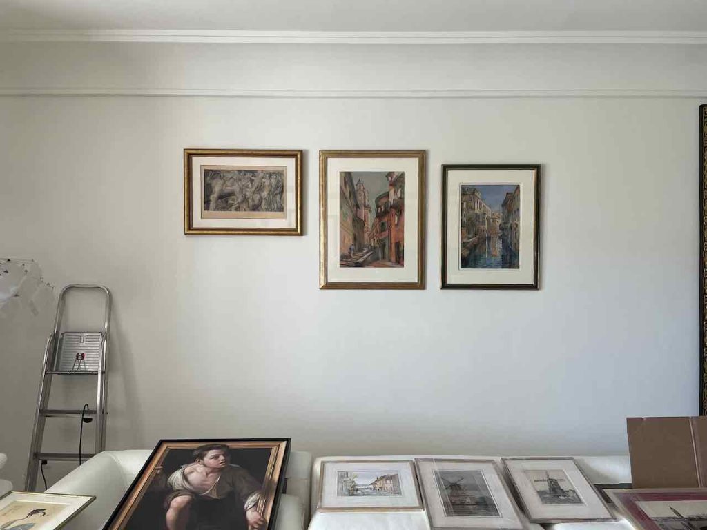
Initial hanging - day zero
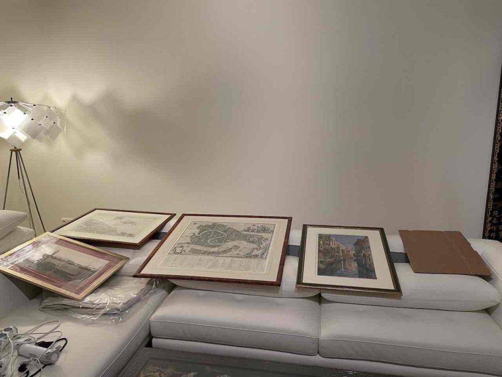
The two large maps, two paintings and one large antique photograph were of Venice, so our initial idea was to use the larger wall to display this collection.
You can see a cardboard square representing the second painting that we hoped to bring to the apartment later in the year.
This idea of a Venice-themed wall failed. In part because we could not see how to fit the other paintings on the other wall. Nor could we see a way to include some of the other paintings within a thematic collection on Venice.
However, the most important obstacle was elsewhere. The cool thing about maps is the ability to get up close and see the detail, e.g. the largest map was a wonderfully detailed folding street map of Venice dating from 1787. Hanging the thematic collection of Venice over the sofa would have meant that we could only view the maps from a distance.
We decide to place the two Venice maps on the smaller separate wall.
Second hanging - day one
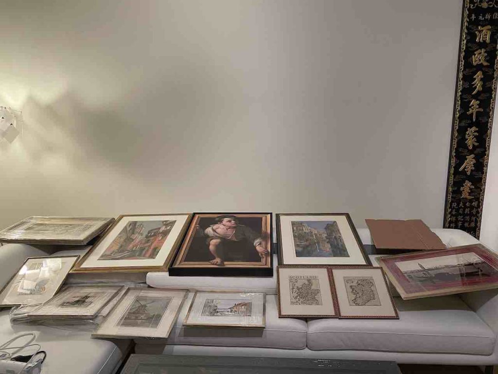
Having removed the two big maps, the challenge now was to see how to put all the other pieces on the big wall. This produced what I would call an ‘over busy’ wall.
This is not in itself a problem, since we can see on the Web examples of overly busy walls made up of 10’s of smaller paintings, photos, etc. all stuck close together.
Our problem was that the three larger paintings created a strong visual block to which everything else looked both ‘squashed up’ and secondary.
We had to decided to remove a few of the pieces, and try again.
Third hanging - day two
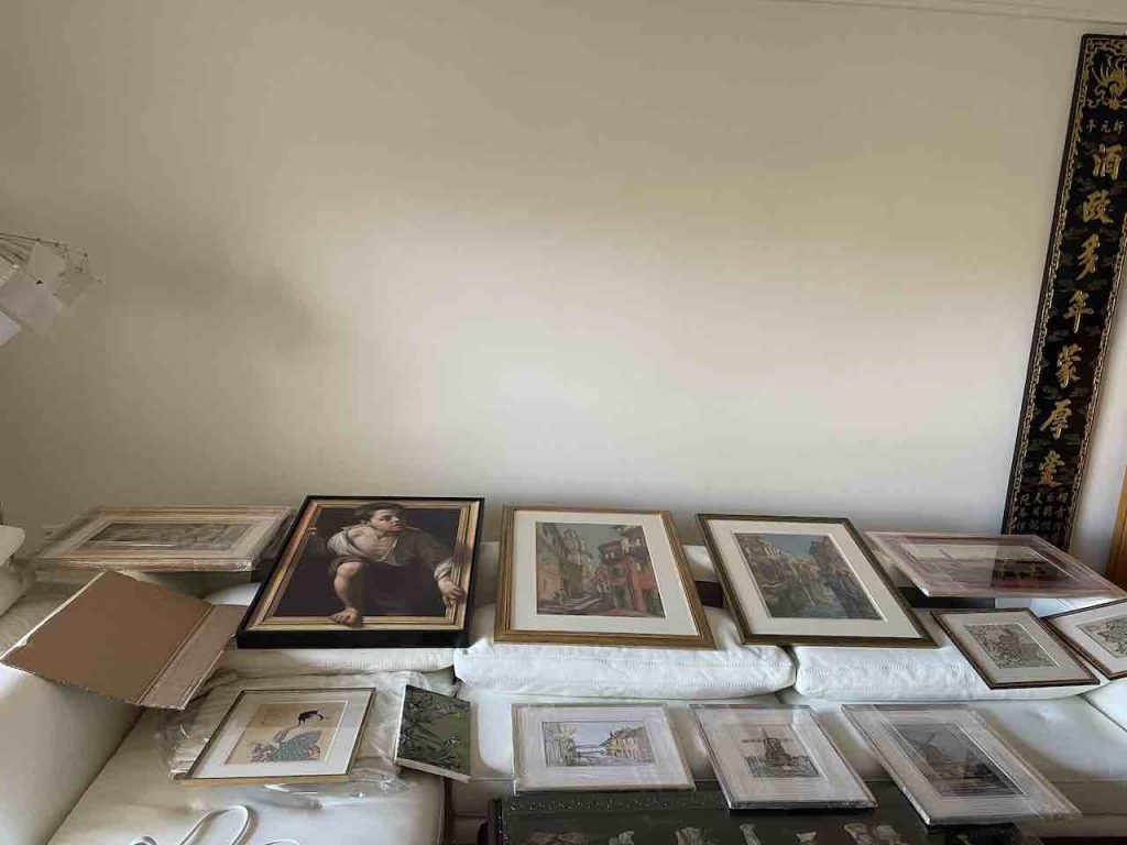
It’s important to try out several different options. Above we are still working on a centre-line for the three larger paintings, but this configuration looked better. Adding the two large items to the left and right, was too top heavy.
I could not see how to align the lower row of smaller pieces on a centre line. I preferred to align them on the top of the frame, but this did not sit well with the upper row of larger paintings.
Fourth hanging - day three
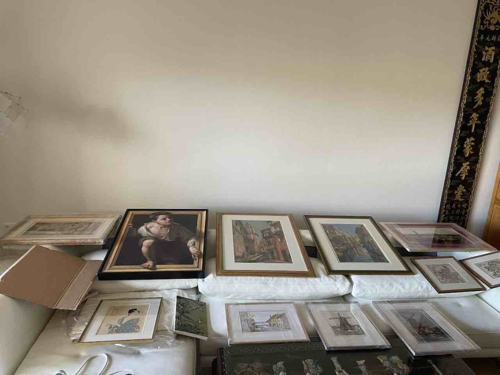
Leaving each configuration overnight brought a new and improved understanding about what we wanted and what was possible.
The above configuration might look very similar, but in fact the larger three central paintings are now aligned on the lower edge of the frames, creating a constant gap with the upper edge of the frames of the small peices below.
I also liked the idea to ‘break the line’, and not hang the three larger paintings all along the same centre-line.
Finally we had to decide to remove a few of the pieces, and try again.
Hanging the paintings
Laying out the art pieces is one challenge, but the next was then to actually hang them according to the plan.
We had finally decided on which pieces to remove, and on a new layout, which as mentioned above ‘broke the line’.
On the larger wall I started by placing the two larger paintings next to each other aligned on the lower frame edge, and then gradually built out from there.
Perhaps the most delicate decision was to find the lowest point on the gallery wall, ensuring that it was the right height above the sofa, and then find the eye-line to use as a centre-line for the collection.
The most important step was to make all the measurements, and draw them all out on a pieced of paper, writing in all the calculations, e.g. dimensions, spacings, hanging heights, etc. The next two most important steps were to verify and reverify all the dimensions, spacings, and hanging heights. I found two big errors on the first verification, and one small error on the re-verification.
And the results...
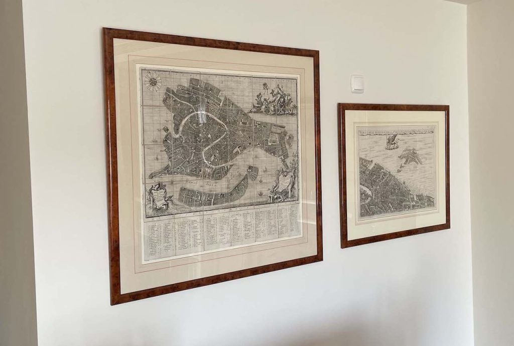
We were very happy with the decision to place the two maps of Venice side-by-side on a separate wall. We can get up close an observe the detail on each, and it makes all the difference to how a map is appreciated.
It’s also the reason why we removed the other smaller maps from the final picture wall.
The picture wall
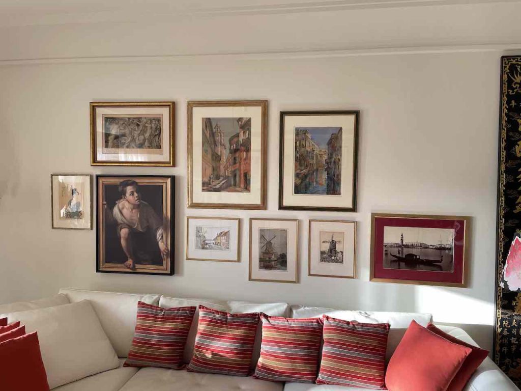
Frankly we love our picture wall, and there is still a bit of space left for the future.
Fast forward to early 2025
As mentioned above, there was a “bit of space left for the future”. Well the future arrived in the form of four additional paintings. To get the right balance we also removed one piece which I must admit always looked a bit ‘out of place’.