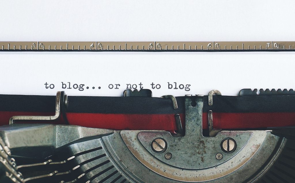
What are we looking at?
After having adopted WordPress, and having taken some timid steps to generate my first posts, I felt confident that I had mastered the basics.
In the past I know I was using excessively large images on my webpages, so starting a new blog I decided to adopt the advice from Squarespace to “use images 500 KB or less to help your site load quickly”. And I had installed the Media Library Folders plugin so that I could organise better my Media Library assets, e.g. creating custom folders to collect the images used on each specific blog post.
After a couple of weeks I noticed that two images in the Media Library were replaced by blanks, and this was followed quite quickly with a total of 27 blanks from an asset library of 280 images. The metadata remained in the Media Library, but the images had disappeared from the server, and naturally also from the blog posts I had created.
I needed to find out why these particular images had disappeared, repair the damage, and ensure that the problem did not reappear again.
Realising I still had a lot to learn, I went back to basics.
How does WordPress store images?
Normally, WordPress stores all images and other media files in /wp-content/uploads/.
Inside this folder WordPress creates different sub-folders for years and months wp-content/uploads/[years]/[month], and then adds the media files to these folders based on when they were uploaded. The year-month folders feature can be switched off.
I’ve reproduced what is often written about WordPress, but as far as I can see the year-month folders are created when the images are uploaded, but they are actually named when the page or post is intended for publication. Later in the post there is an example of a /wp-content/uploads/ with a folder for 2025, when we are still in May 2023.
More on image size and quality
The size and quality of an image for use on a webpage is determined by a variety of things:-
- The physical size of an image is based upon two things. Firstly, the size of the image on the screen, and secondly the file size. Generally, the file size is treated as a different issue.
- The file size is what is stored on the hard drive or server.
- Resolution is the number of pixels (px) in an image. Resolution is sometimes identified by the width and height of the image (expressed in pixels per inch or ppi) as well as the total number of pixels in the image.
- There are a number of image types (file formats) popularly found on the Internet, such
jpeg, gif, pngand for faviconsico.
The physical size of an image is often thought of as the dimensions which it would have when printed (ex: 8.5″ x 11″). But equally the image size can refer to the ‘space’ the image will occupy on a webpage, expressed in pixels (px), e.g. 600×800. This space will depend on the WordPress Theme and plugins used, and they can require the same image to be available is several different sizes. It’s for this reason that WordPress automatically creates a variety of physical sizes of the same image (e.g. thumbnail, medium, large).
File size will dictate the time it takes to load a page or post. The size of the file is related to image resolution, which is equated with quality. The larger the file, the higher the resolution, the better the image quality. Advice what constitutes a good image file size for WordPress varies from one source to another. Since higher resolutions mean larger files, there is a compromise to be made between image quality and file size.
Fortunately, file types such as jpeg (often written as just jpg) include image compression features, and the image is only decompressed in the browser.
Image resolution of an electronic image device (e.g. screen, monitor, TV, camera, scanner, etc.) is typically described in pixel density, which refers to how many pixels are displayed per inch of an image (or ppi). In reality pixel density (e.g. display resolution) and image resolution are not exactly the same thing. Pixel density described the amount of detail that can be presented on a specific physical surface or device, whereas image resolution describes the amount of pixel information in an image regardless of its scale.
Often we see mention of a display size such as 1920×1080 as a display resolution when it’s not, since the resolution of a display will depend on the pixel density, e.g. a display with 72ppi will not look as ‘sharp’ or ‘crisp’ as a Retina display with 300ppi.
Experts often suggest that images should be saved with a resolution of 72ppi, but this is based upon a misconception that resolution or ppi values are the deciding factor of image quality on the web, whereas it’s actually about pixel dimensions. Check out why 72ppi was picked and why it’s better to target Retina displays (of which there are a multitude, but all exceed 200ppi). The problem is that each screen or monitor is different and has a different resolution, so it makes it difficult to design a website that contains images that display perfectly on every type of display.
So the question is how far should I go today in order to protect myself from a high-resolution web future?
The Media Library Folders plugin
I’ve installed the Media Library Folders plugin which means I can create folders and move, delete, and rename files directly in the WordPress dashboard.
I can create folders (and sub-folders) and I can upload image files to the different folders.
More importantly I can drag-and-drop files from the ‘year-month’ folders to folders and sub-folders with more intuitive names, e.g. collect all images related to a particular hotel review in a sub-folder with the name of the hotel.
I can also copy image files and move a copy to a different folder, and I can also change file names.
It’s not possible to rename or move existing folders inside the Media Library Folders plugin. Instead, I would have to create a new folder in the desired location, move all image files into it, and then delete the old empty folder.

Above we can see the /wp-content/uploads/ folder and the year and month folders created by WordPress. In addition we can see the folders created with the plugin Media Library Folders. These correspond to different posts I’ve made. Using the plugin I drag-and-drop into each of these sub-folders the images that are used on that specific post.
It’s also possible to use the plugin to add custom folders in the year-month folders, e.g. add event sub-folders to a specific year-month sub-folder to collect all media assets related to events in that month.
WordPress creates additional images

Above we have the image files created automatically after uploaded two different jpeg images, namely Fokker-F-GGDM and Fourth-Idea. The first was a ‘Feature Image‘ of a post, and the second was just another image included in a different post made a day earlier.
By default, WordPress automatically created several different sized copies of these two images. Popular WordPress themes (I use Astra) and plugins can also create additional image sizes automatically, and will also place these in the /wp-content/uploads/ folders.
So we see six different images files automatically created from the original Fokker-F-GGDM (a photo of a specific aircraft).
Most descriptions mention that WordPress automatically creates three images, a thumbnail (150×150), a medium (300×300) and a large (1024×1024), and these are visible in Dashboard>Setting>Media. These image sizes are expressed in pixels (px).
However elsewhere it was also mentioned that the WordPress Media Uploader actually generates five different images, i.e. thumbnail, medium, medium-large (768×768), large, and scaled (as well as keeping the original ‘full’ image).
As far as I know the reality is that WordPress can create between three and nine images depending upon the size of the original, and they range from 150×150 through to 2048×2048. So 150px is thumbnail, 300px is medium, 768px is medium-large, 1024px is large, 1536px is twice medium-large, and 2048px is twice large. These are the ‘core’ image sizes, and there is also the original ‘full’ sized image and in some cases a ‘scaled-image‘ as well. I’ve also seen mentioned of custom sizes such as landscape size (1200×900) and a portrait size (900×1200), as well as custom sizes for banners, logo’s, etc.
Check out “WordPress Image Sizes: a Ticking Time BOMB?“, which outlines how WordPress evolved in the treatment of image sizes. The author mentions that it is possible that an original 55kB image can take up to 650kB with all the alternatives sizes created for no real purpose. He makes a convincing argument for the plugin Force Regenerate Thumbnails, which doesn’t just generate new images for any new image sizes, but it also deletes all image versions that are no longer in use. So it deletes all versions except the originals and then generates new thumbnails that are only currently active. And this included all images uploaded to the Media Library before adopting the plugin.
I’ve read that a WordPress background image should be 1920×1080, ‘Featured Image’ 1200×900, landscape also 1200×900 and 900×1200 portrait, a banner 1048×250, and an image in a blog post 1200×630. I’m not sure if these image sizes were recommended, or suggestions, or in some way considered ‘best’.
Numerous experts recommend not exceeding a maximum size of 1920×1080 pixels, and it’s often suggested to keep to 1024×512 pixels for images inserted into posts or pages.
But what a surprise… not all experts agree on what is the best size for an image on a blog post. Some suggest using the same dimensions as for a Featured Image (1200×628), and Google actually recommends that large images be at least 1200px wide. In fact, as outlined in this article, image quality can affect search engine optimisation (SEO).
We also have to remember that additional image files might be needed if a post is expected to be ‘responsive‘, that is viewed on a tablet (type iPad) or mobile phone (type iPhone). Although I’ve read that in fact WordPress offers its pre-established list to the browser so it can select an image that is appropriate for the visitor’s device. If the visitor is using a mobile device, they’ll receive a smaller image.
And in addition specific apps, such as Facebook, Twitter, Instagram, Pinterest, LinkedIn, YouTube, TikTok, Twitch, etc. have their own requirements concerning the sizes of images, videos, etc. Louise Myers has a ‘cheat sheet’ that covers most of these social media platforms, and none of them impose the same requirements even for a simple thing like a profile photo.
For my two images, Fokker-F-GGDM and Fourth-Idea, we can see that six versions were created based upon six different image widths. Heights were different, presumable because each version was scaled proportionally from the original (that is without distortion). The widths (in pixels) were 150px (thumbnail), 300px (medium), 768px (medium-large), 1024px (large), 1536px (twice-medium-large), and 2048px (twice-large). Smaller original images create fewer versions, because images are only automatically scale down in size.
The easiest way to understand the impact of different image sizes and widths is to check the options using a test image. I took a 276kB jpeg image (1764×534) at 144ppi. It generated five smaller alternative image files (1536×465 down to 150×150) for a total of 542kB including the original ‘full’ image file.
I then created an alternative image 1280×387 of 182kB, always 144ppi, which generated only four smaller alternatives (1024×310 to 150×150) for a total of 314kB including the original ‘full’ image file.
Finally I create an alternative image 1200×368 of 165kb, always 144ppi, which generated only four smaller alternatives (1024×310 to 150×150) for a total of 294kB including the original ‘full’ image file.
These three alternatives when uploaded into a blog post were all ‘large’ images (1024×1024) and to the naked eye looked identical because they were almost the same file size 75.4kB, 73.9kB and 72.4kB respectively (and all 144ppi).
From this I decided to focus on using images set to a width of 1280.
Scaled images
As mentioned about another image format created automatically by WordPress (or a theme or plugin) is file-name-scaled.jpeg (or file-name-scaled.jpg).
So what is a ‘scaled’ image? It is an image that has been sized to fit the exact dimensions for the page or post in question. The idea is simple, images that are too small and are scaled up in the browser will be blurry, and images that are too big cause the browser to spend extra time and resources to load and scale them down to fit the webpage.
So WordPress automatically resizes images to help both save bandwidth and avoid the need to manually resize images.
It would appear that in WordPress, image scaling is automatic for large images over 2560px on the longest edge.
I have taken the trouble to analyse the 280 images in the Media Library, including the 27 blank images. So what did we learn about scaled images?
All the scaled images had one side longer that 2560px.
In almost all cases I had attempted to reduce the file size, but I missed three images. In the first case a 3.1MB image was scaled to 632kB, in the second case a 1MB image was scaled to 351kB, and a third image of 3.5MB was scaled down to 675kB.
However, in the vast majority of cases when an image was scaled ‘down’ the final file size was actually bigger, sometime substantially bigger. As an example a 400kB image (2434×2661) actually became 741kB once ‘scaled’. In a few very rare cases the scaling was down, e.g. a 419kB image (2626×1168) scaled down to 269kB. In some cases scaling made a negligible difference, e.g. a 374kB image (4032×3024) became a 378kB image. The first example was scanned image (300dpi) that I had already reduced from 1.2MB to 400kB. The second example was a screen capture (144ppi), and the third was a photo taken with an iPhone that I had already reduced from 1.9MB to 374kb (72ppi).
For some images the original image was automatically converted into six different sized images, plus a scaled-image. But in the vast majority of cases something in addition occurred.

What we see above is an image Antique-Marble-before uploaded on 25 April 2023, and six derived images created at the same time, and in additional a scaled-image of the original.
Then three days later on the 28 April 2023 additional scaled-images were automatically created of the six different sized derived images, each only marginally smaller.
My Astra theme
As far as I know the theme I use, Astra, does not create any new images.
Let’s focus on the ‘Featured Image‘ in the Astra theme. Featured Image was originally called Post Thumbnail, and is a theme feature, that is one of a specific set of functionalities that can be enabled by theme authors.
It is a representative image for Posts, Pages or Custom Post Types. The display of this image is up to the theme, but it is especially useful for ‘magazine-style’ themes where each post has an image that characterises and represents that post throughout the website.
If a post has a Featured Image, that image will appear as a thumbnail next to (or above) the post’s title in the blog feed. The thumbnail version of an image can also be used within a post. For instance, a few small photos can be displayed in a row.
However the thumbnail is often too small to be visually appealing, and larger images should be used to break up text blocks. The most impact comes from ‘large’ (1024×1024) or original ‘full-sized’ images.
One of the most common WordPress image size questions is, “What size image should I use for my featured images”?
Unfortunately, there is no one-size-fits-all answer. The perfect Featured Image for one site may differ from another site. This is primarily because different themes use different layout widths, so each theme may have a custom size that works best within its layout.
And as already mentioned, each social media service also has its own ‘perfect’ image size, and of course, none of them tend to scale well with the others.
Astra stresses that a great Featured Image is a must, and above all they must not be blurry or cut-off when seen on a webpage. The Feature Image may be the first image seen by a visitor to a page or post, and it’s the image that travels on social media platforms when pages or posts are shared.
The Astra theme recommends Featured Image of 1200×628, which is equivalent to 16:9 aspect ratio.
Some Astra theme users prefer to stay with a standard image size of 1280×720, so that it can be used elsewhere without any loss of quality. They accept that a small portion of the image will be cropped when presented on a post with a width of 1200.
What can we do with images in the WordPress Media Library?
I usually add an image as needed using the image widget, but it’s possible to add media assets (drag-and-drop) through the Media Add New Screen. You can add one asset at the time, or bulk load a group of varied assets (e.g. images, video, etc.).
It is possible to Edit Media including the file metadata (e.g. file name, Alt Test, etc.) and the image itself (e.g. crop, rotate, flip, and scale).
‘Scale’ means the proportionally scaling of the original image. For best results, scaling should be done before cropping, flipping, or rotating. Images can only be scaled down, not up.
What does '?' on an image in a post or in the WordPress Media Library?
A ‘broken image’ can have several meanings. The most obvious is that the image format is not supported. This was not the case with my problem, all my images are standard jpeg’s.
Experts suggest to start with some simple checks, and the easiest is to look if the missing image is still on the server. This immediately defined better my problem because none of the missing images were on the server.
Images that disappear have been discussed by others, and the reasons vary, as do the solutions. In some cases the images were on the server, but not shown in the Media Library, in other cases the problem was with plugins.
I didn’t think my problem was with a plugin since I had only used Starter Templates from Astra, Elementor, WPForms, and Media Library Folders.
I admit that in the past I would paste large image files into my webpages. I was lazy, and didn’t look to see how I should optimise the images.
In moving to WordPress I decided to reduce the file size before uploading an image to my blog posts. I felt that reducing a 2-3 MB image to a 300-500 kB was good enough.
Initially this seemed to work. But when the WordPress media library grew to more than 200 images (some were much smaller that the 500 kB I had fixed, but a few were a bit bigger) I noticed a problem.
In the media library and on my blog posts a couple of images were missing, and replaced by a blue ‘?’.
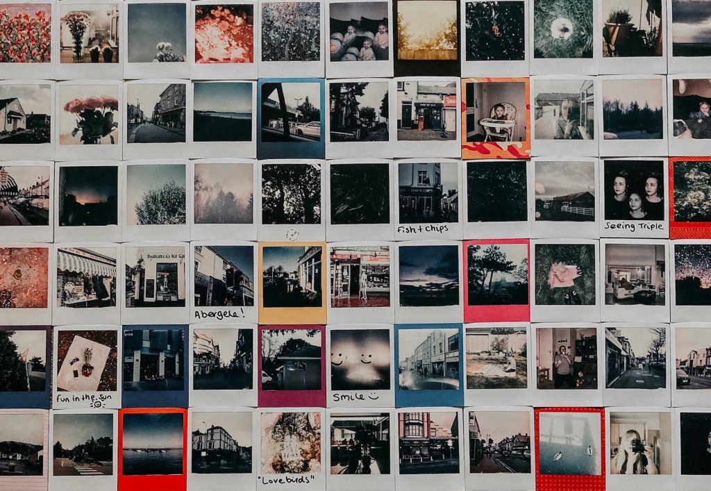
Then a bit later it was a total of 27 images that went missing, as seen in this blogs header image.
In all cases a ‘-scaled’ had been added to the end of the URL (e.g. ….rating/living-room-scaled.jpeg), but there were also numerous images still visible that also has this ‘addition’ to their URL.
Time to search for this problem.
One person had the same problem and echoed my same concern, in that I didn’t want to have to re-upload photos and re-do my blog posts. They had taken the usual first option of dis-activating all the plugins, but this was not the solution. There was mention of the possibility that the host was using a security tool that blocked certain types of media. Others suggested that it was browser dependent.
How to fix 'broken' images?
search on ‘wordpress scaled images’
https://www.wpbeginner.com/beginners-guide/how-to-fix-common-image-issues-in-wordpress/
My 'rule of thumb'
Don’t change the pixel density ppi.
Don’t exceed a maximum size of 1920×1080 pixels, which can be used as background image.
Focus on scaling images to a width of 1280 pixels. I think that I also need to focus on cropping images before scaling so as to better present the key elements that are to be highlighted.
https://www.thelinescompany.co.nz/site/plugins/media-library-plus/readme.txt
does Force Regenerate Thumbnails work with the Media Library Folders plugin
https://www.wpbeginner.com/plugins/how-to-backup-restore-your-wordpress-site-with-updraftplus/
Adopting Force Regenerate Thumbnails
How to Regenerate Thumbnails in WordPress looks at how to reset image dimensions in WordPress core settings. 9+ Best WordPress Force Regenerate Thumbnails Apps in 2023 is also useful in that it also gives an insight into what is practically possible and what problems may be hidden but are important, e.g. the upper limit to the number of thumbnails that can restore
Reviews show that it does the job, but there were comments that noted that it did not remove all unused thumbnails, yet most comments wrote that it did. Another comment said that it overwrote EXIF data.
A comment in April 2023 asked if it was possible to only update files in a specific folder. The answer was that this may not be possible. However, you can select specific images via the media library in list mode and use the drop down at the top to regenerate thumbnails for just those images. Depending on how you are managing your different folders, you should be able to switch to a folder, select all images there, and then regenerate them.
Worth coming back to this option at a later date.