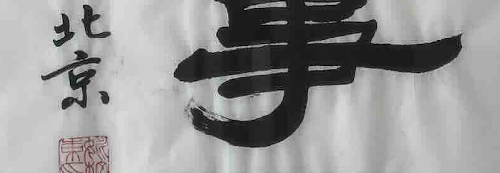

On the 12-14 April 2002 I had the privilege to be in a conference in Tsinghua University, in Beijing.
During a visit linked to the conference, my wife and I were presented to a local calligrapher who wrote this panel for us. It took him about 10-15 minutes, and they were very surprised when my wife thanked them in Chinese. I must admit, when she said it, she looked as surprised as everyone else. Our translator confirmed that my wife has said thank you in a rather old style, possibly learnt during her childhood in IndoChina.
We were honoured to receive such a gift, and today it hangs in our apartment in the Italian Alps.
The below translation and analysis was provided by my friendly ChatGPT.
The Main Text
家和万事兴 (jiā hé wàn shì xīng)
When the family lives in harmony, all affairs prosper.
This is a traditional Chinese idiom and is a blessing for household peace and success. It emphasises that family harmony is the foundation of prosperity in every aspect of life. This expression is often found in calligraphy panels.
Side Inscription (smaller characters)
己亥年 仲春 杉石于北京
In mid-spring of the Year of the Pig, Shan Shi, in Beijing.
The round red seal at the top looks more decorative, and the square red seal at the bottom is the artist’s seal (signature chop).
The calligrapher was a middle-aged man named 杉石 (Shan Shi), but that is all we know about him. In fact the name could be a pseudonym, studio name, or alternate name (号, pen name). Given that “杉” (fir tree) and “石” (stone) suggests stability and uprightness, this is very typical of pen names in Chinese culture.
The date 己亥 refers to the Year of the Pig. This does not correspond to the date of out visit. It might refer to 1959 (Mao-era China, Great Leap Forward period), or it could (more likely) be the birth sign of the artist.
Quality of the Calligraphy
For what it’s worth, I asked ChatGPT to assess the quality of the calligrapher.
It’s conclusion was:
- This is calligraphy in regular script (楷书, kǎishū) leaning towards semi-cursive (行书, xíngshū).
- The characters are well-proportioned: 家 (home), 和 (harmony), 万事 (everything), 兴 (prosper) all keep a stable square form, not leaning or collapsing.
- The overall balance shows competence, though not the razor-sharp precision of the very highest masters. This suggests a serious, trained hand, possibly academic rather than commercial.
- Strokes show variation in thickness, indicating the brush was used properly, i.e. pressing and lifting to give weight to horizontal and vertical lines.
- The horizontal strokes (横, héng) in “万” and “事” are slightly uneven in energy, not weak, but not always continuous to the end. This suggests confidence, but not the absolute control of a lifelong master.
- The hook strokes (钩, gōu), e.g. in 兴, are nicely turned, so clear evidence of training.
- The ink tone looks consistent, dark, and even, showing the artist kept a steady rhythm and didn’t “run dry” mid-stroke.
- There is some natural fading at the stroke ends, which is considered elegant breathing space in calligraphy.
- The piece has a pleasant rhythm, and the characters don’t feel static, there’s a subtle forward energy, especially in 兴 (prosper).
- However, compared with high-level exhibition works, the flow is controlled but not dazzling. It feels more academic/demonstrative than expressive.
So a respectable, competent work by a trained calligrapher.